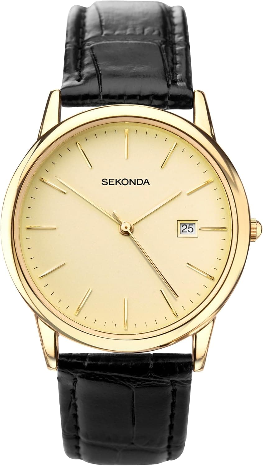
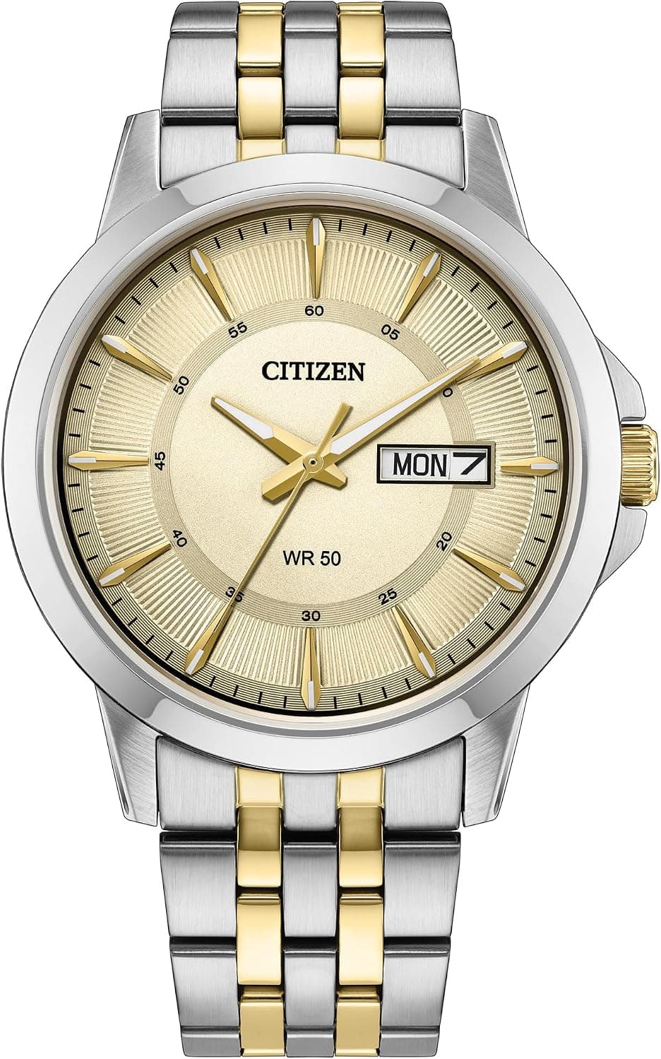
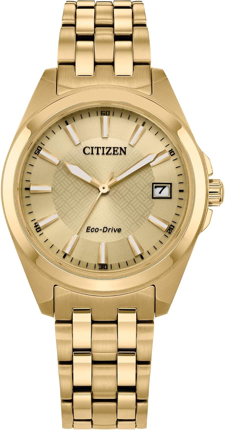
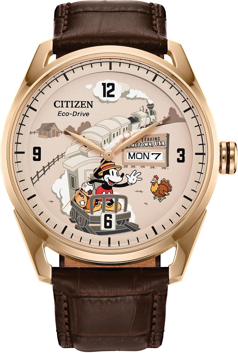
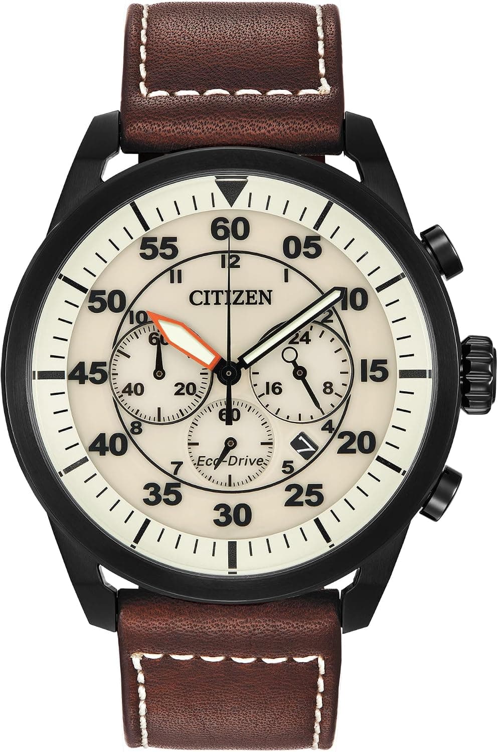
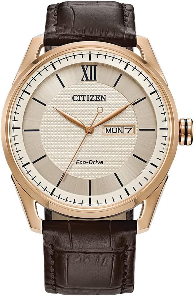
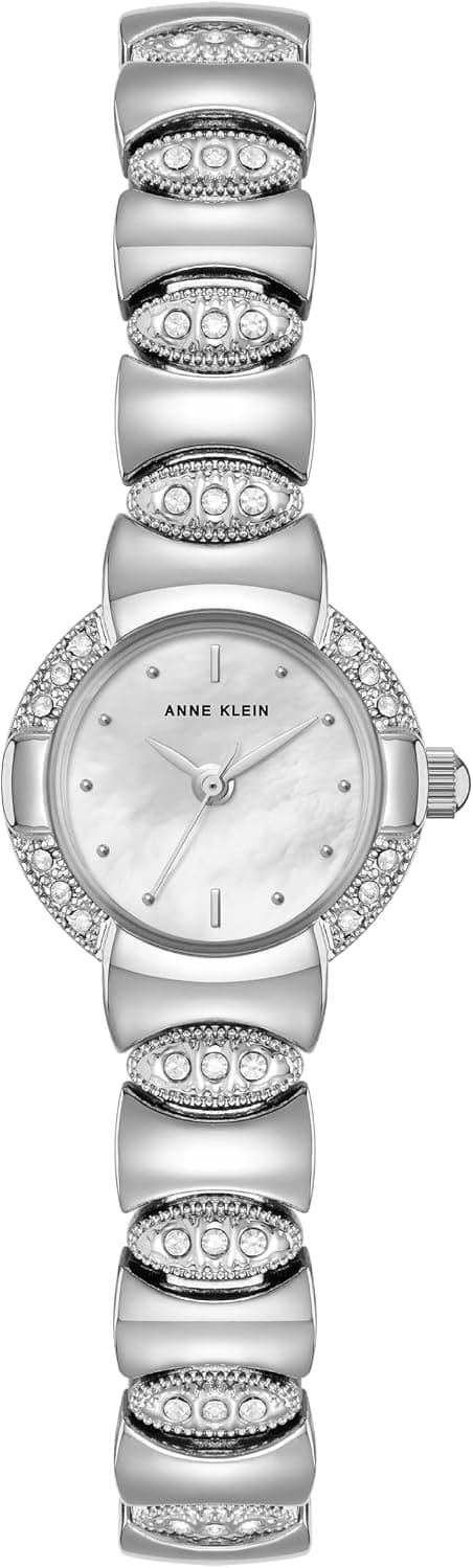
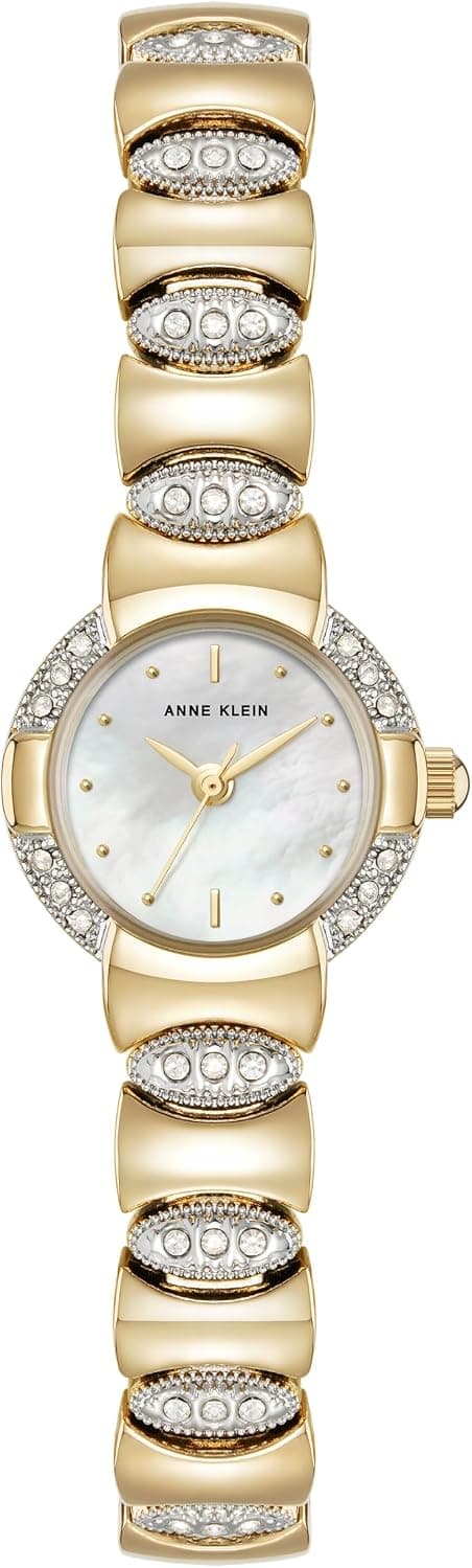
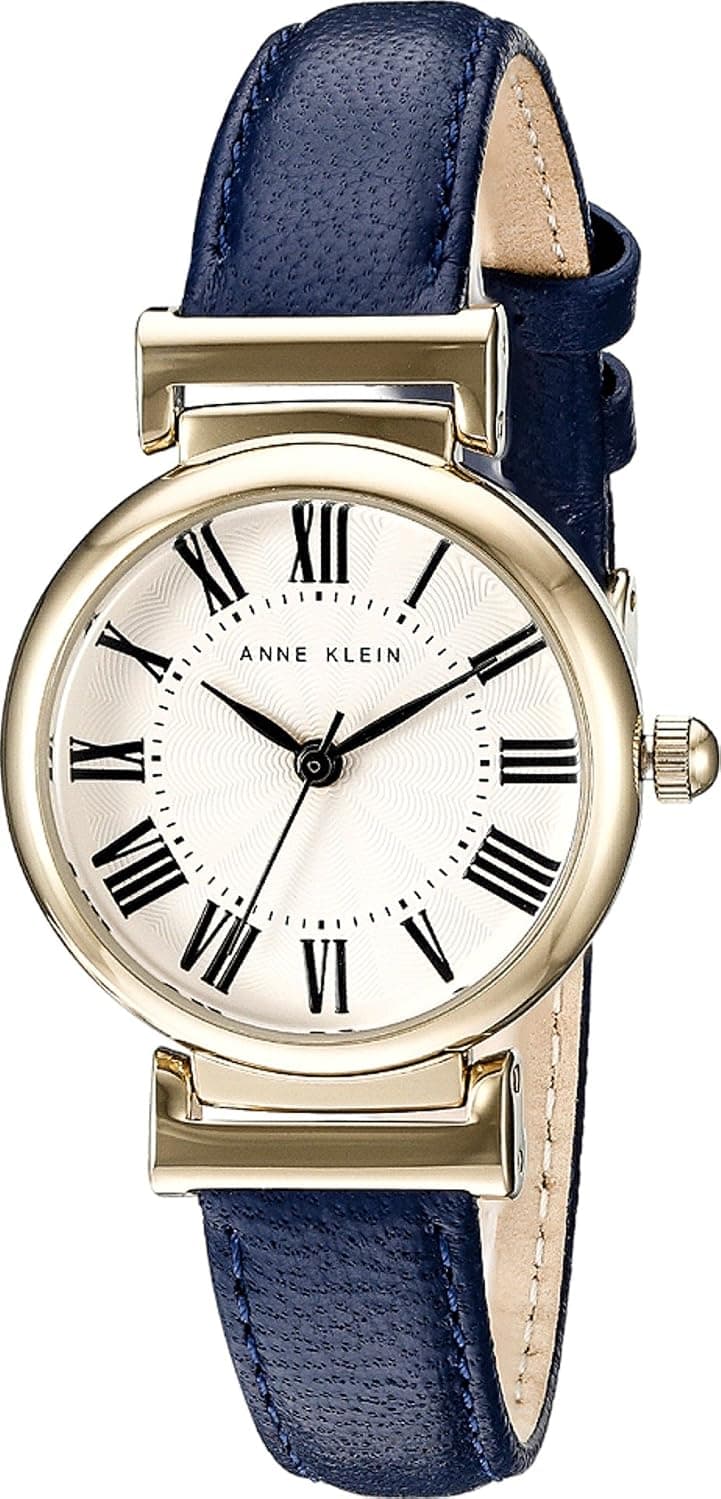
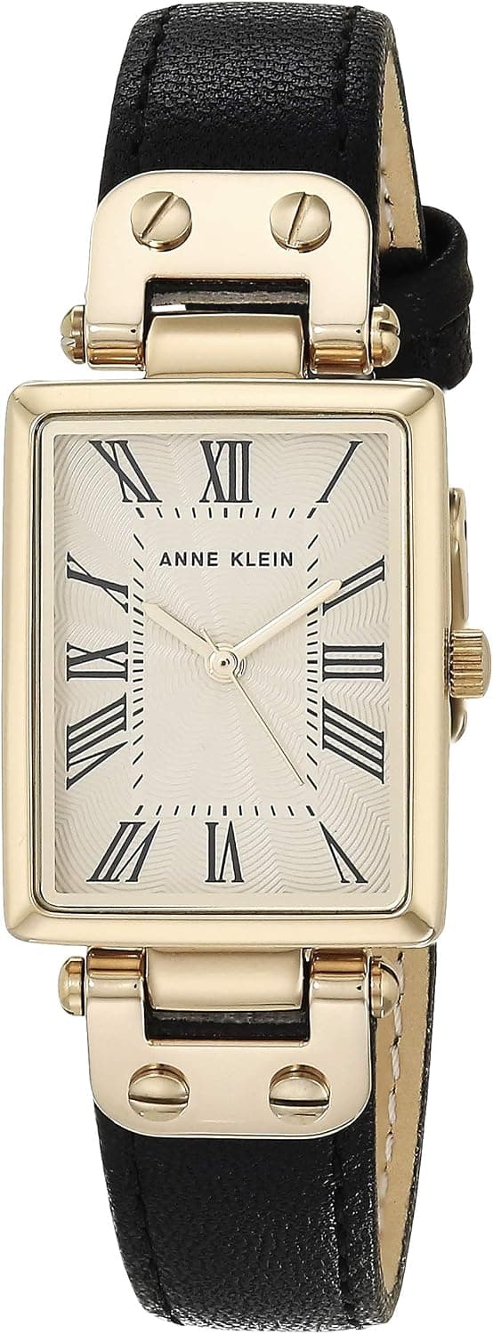
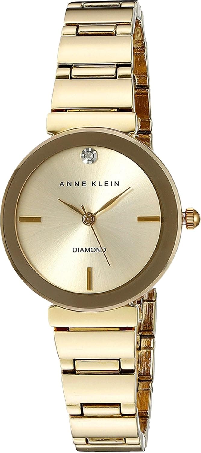
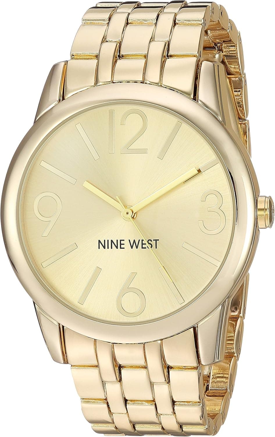
A beige dial is a quieter choice than most colors, and like blue it is really a family rather than a single shade. Warm cream sits close to off-white, dry desert sand reads almost khaki in daylight, and soft taupe leans gray and dusty. What ties them together is a matte, low-contrast surface that keeps a beige dial clearly separate from a crisp white dial on one side and from a chocolate or coffee brown dial on the other. Finish is usually understated by design. Most beige dials are flat matte or lightly grained rather than glossy, which suits their origins, and many are fitted with cream or pumpkin-toned faux-patina lume that mimics aged tritium for a worn-in, vintage feel. The look traces back to mid-century field and military watches, where a legible, non-reflective dial mattered more than shine, and to genuine vintage pieces whose white or silver dials have aged toward cream over decades.
Real examples exist at every level. The Hamilton Khaki Field Mechanical and Murph models are the reference points here, offered with cream and sand dials and aged lume from roughly $475 to $1,045 depending on size, movement and the auto-versus-hand-wound choice. The Seiko Alpinist line, in its cream-dial guise, pairs a warm off-white face with gilt accents and an internal compass bezel for around $725, while the field-style SPB series and several SRPE 'cream' references sit in the $400 to $750 range. Higher up, the Longines Heritage and Spirit families use warm cream and beige dials with faded, vintage-style indices to evoke pilot and explorer history, typically around $2,100 to $2,900. For a polished take, the Tudor Black Bay 58 925 carries a champagne opaline dial that reads warm and cream-like in most light, near $4,150, and original vintage tropical or cream-faded dials from the 1950s and 1960s, where the color is the result of real aging rather than a factory choice, command strong and unpredictable premiums on the collector market.
When choosing, decide how warm you want the tone to be. Cream sits closest to a dress watch and flatters gold or gilt indices, sand and khaki lean rugged and field, and taupe is the most neutral and modern of the three. Because beige is low-contrast by nature, legibility depends heavily on the hands and markers, so look for dark or fully lumed hands against the pale dial rather than thin polished ones that can disappear in certain light. Faux-patina lume is polarizing: it looks natural and warm to some eyes and forced to others, so judge it in person if you can. On strap pairing, beige is forgiving and earthy, working especially well with brown or tan leather, olive and khaki textile, and brushed steel, while it tends to fight against very cool or stark black combinations.
It helps to think in sub-types. True cream is the dressiest and the most vintage-leaning, sitting comfortably under a cuff. Sand and khaki belong to the field and tool tradition and are the most practical for daily, outdoor use. Taupe and grayed beige are the quiet, contemporary option for those who find white too clinical and brown too heavy. Genuine aged or tropical dials are a separate, collector-driven world where condition and originality matter more than the shade itself. Across all of them, beige is an understated, easy-to-wear tone that ages gracefully and rarely tires, which is much of its appeal.