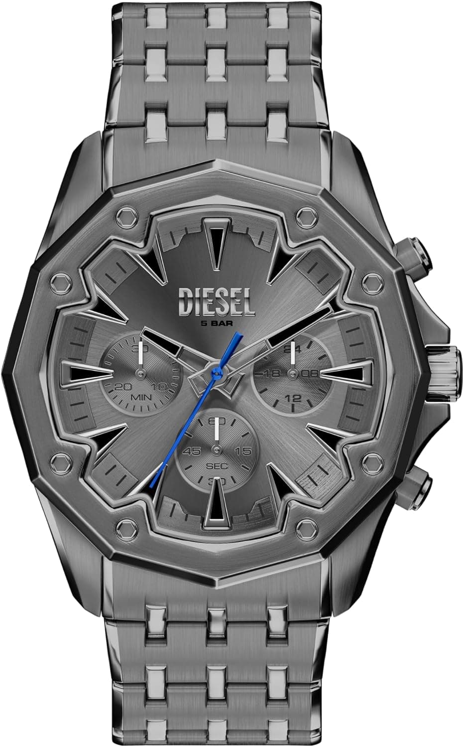
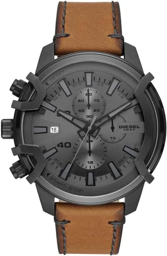
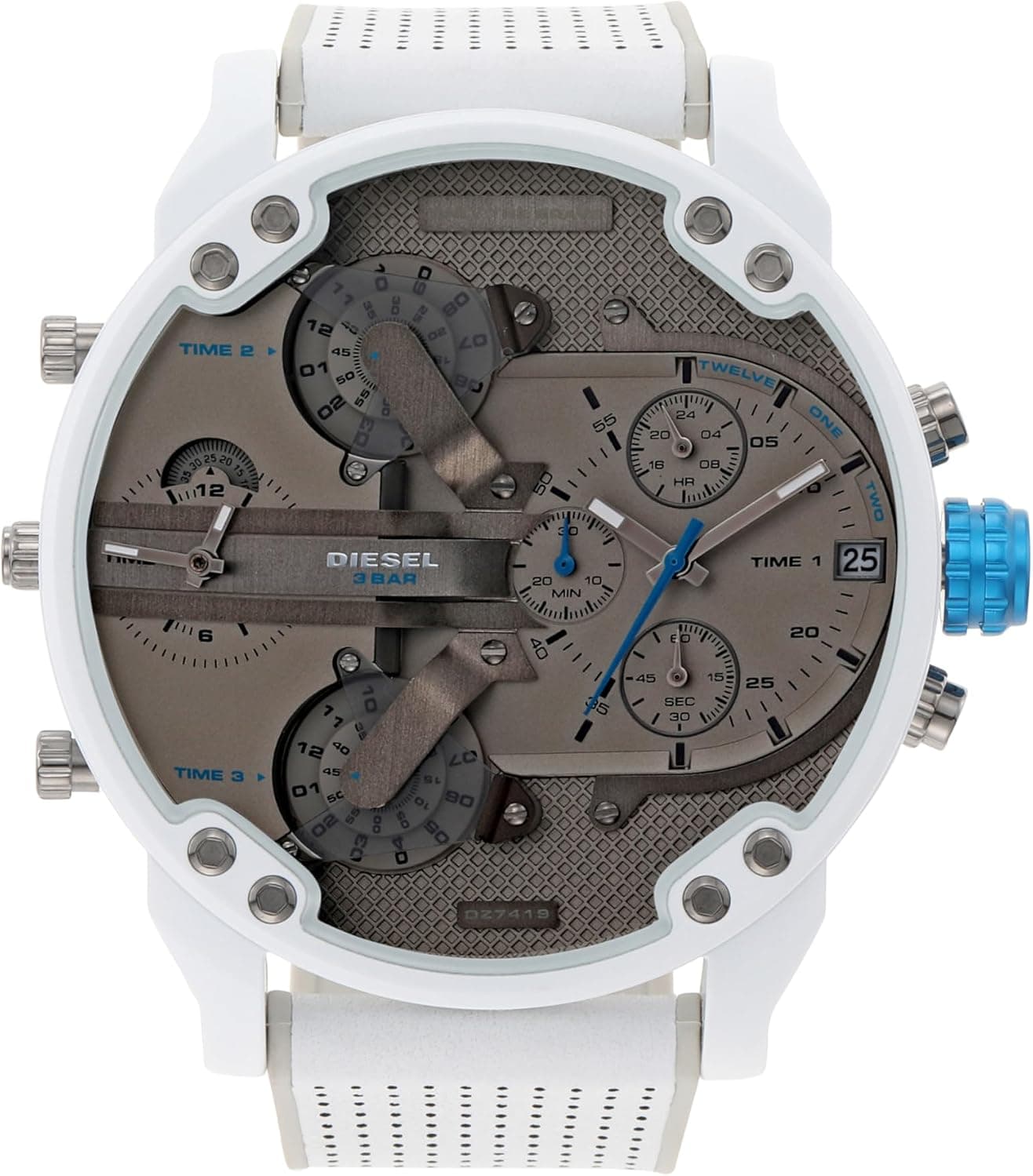
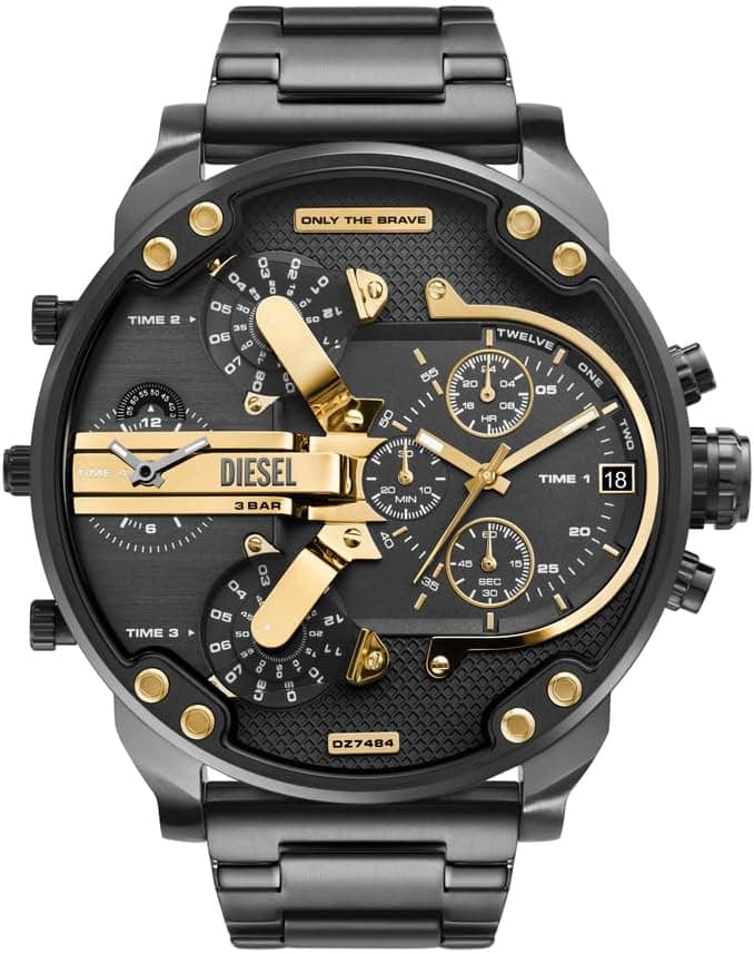
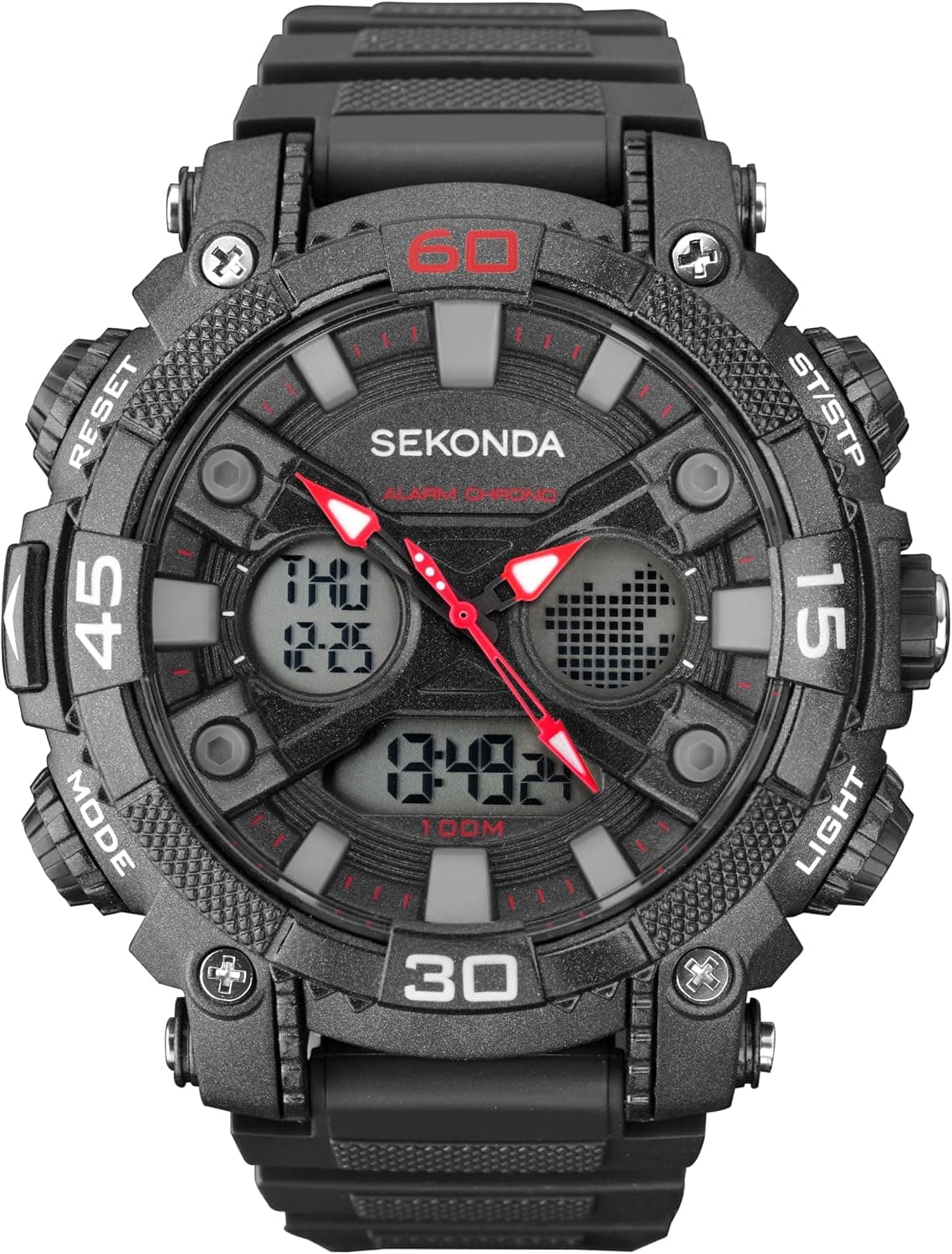
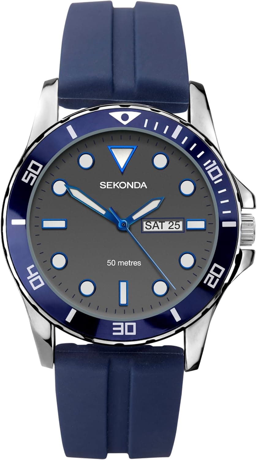
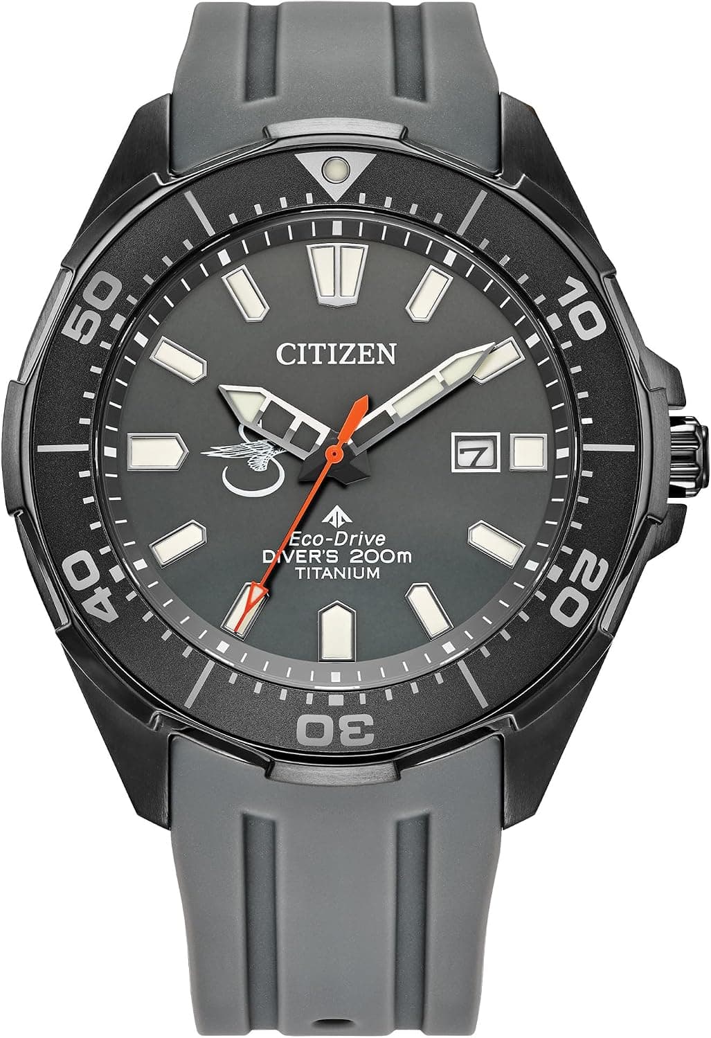
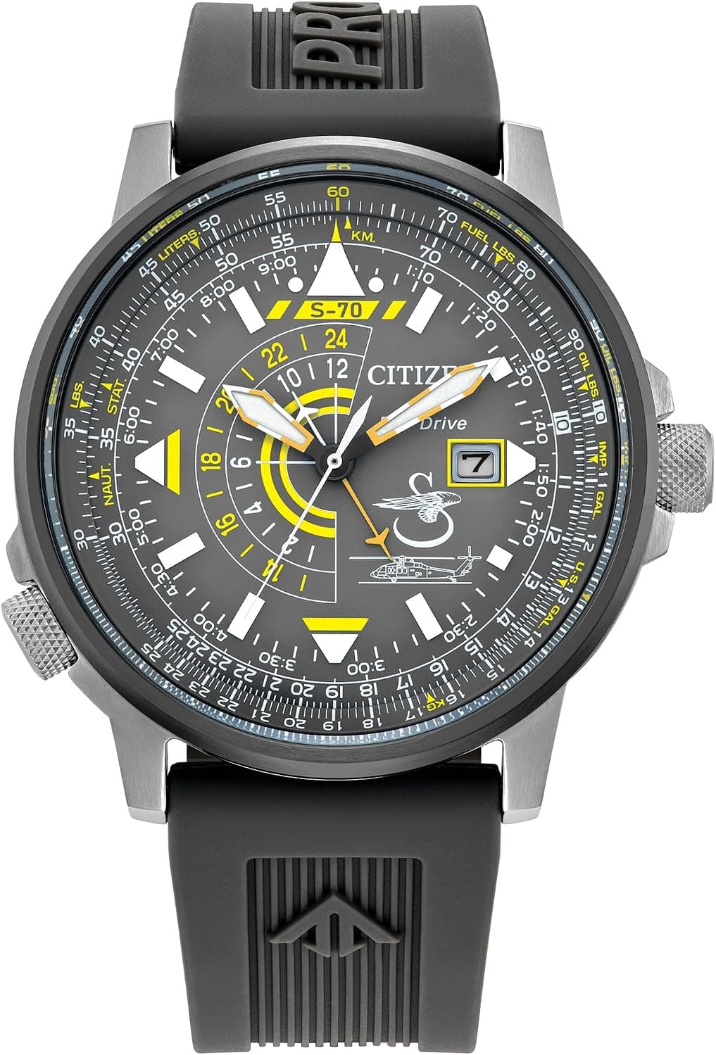
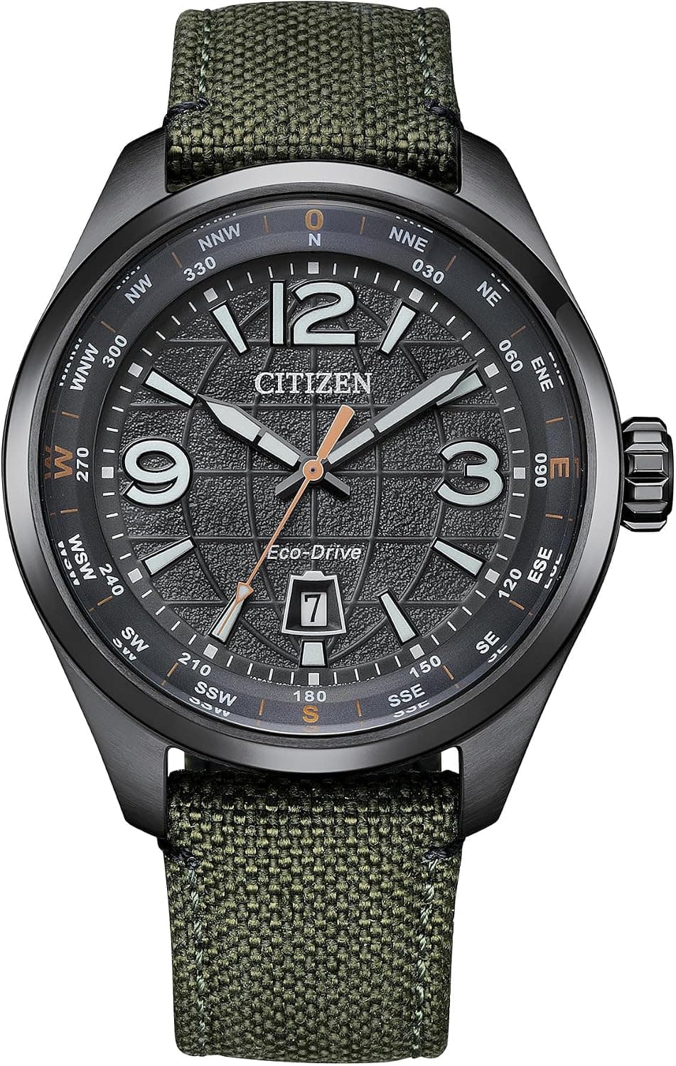
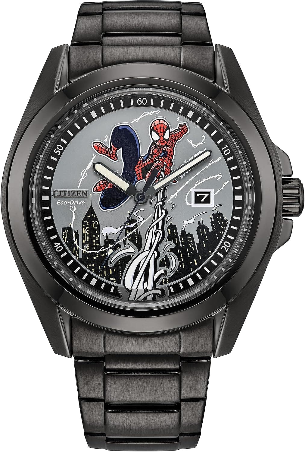
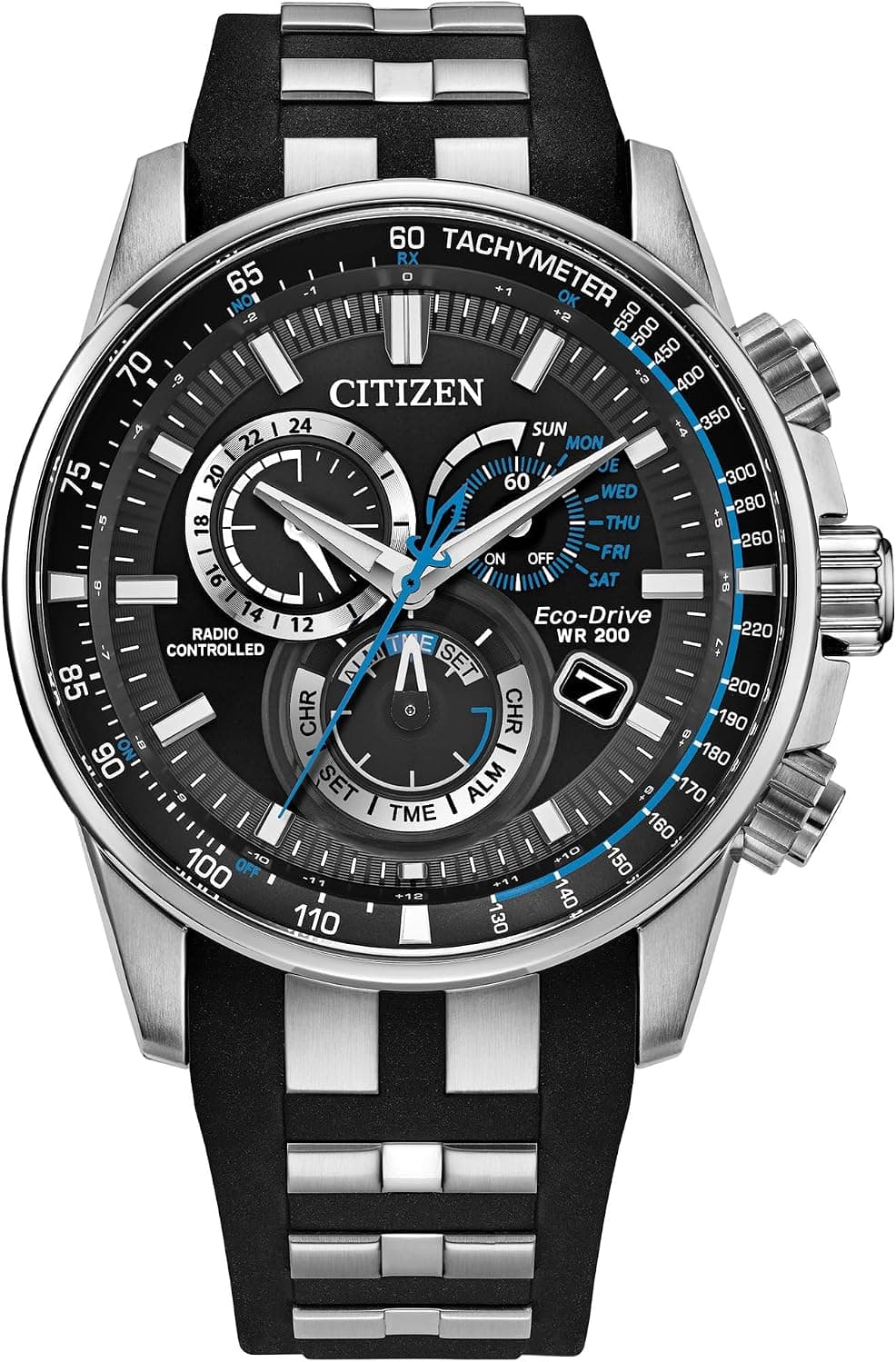
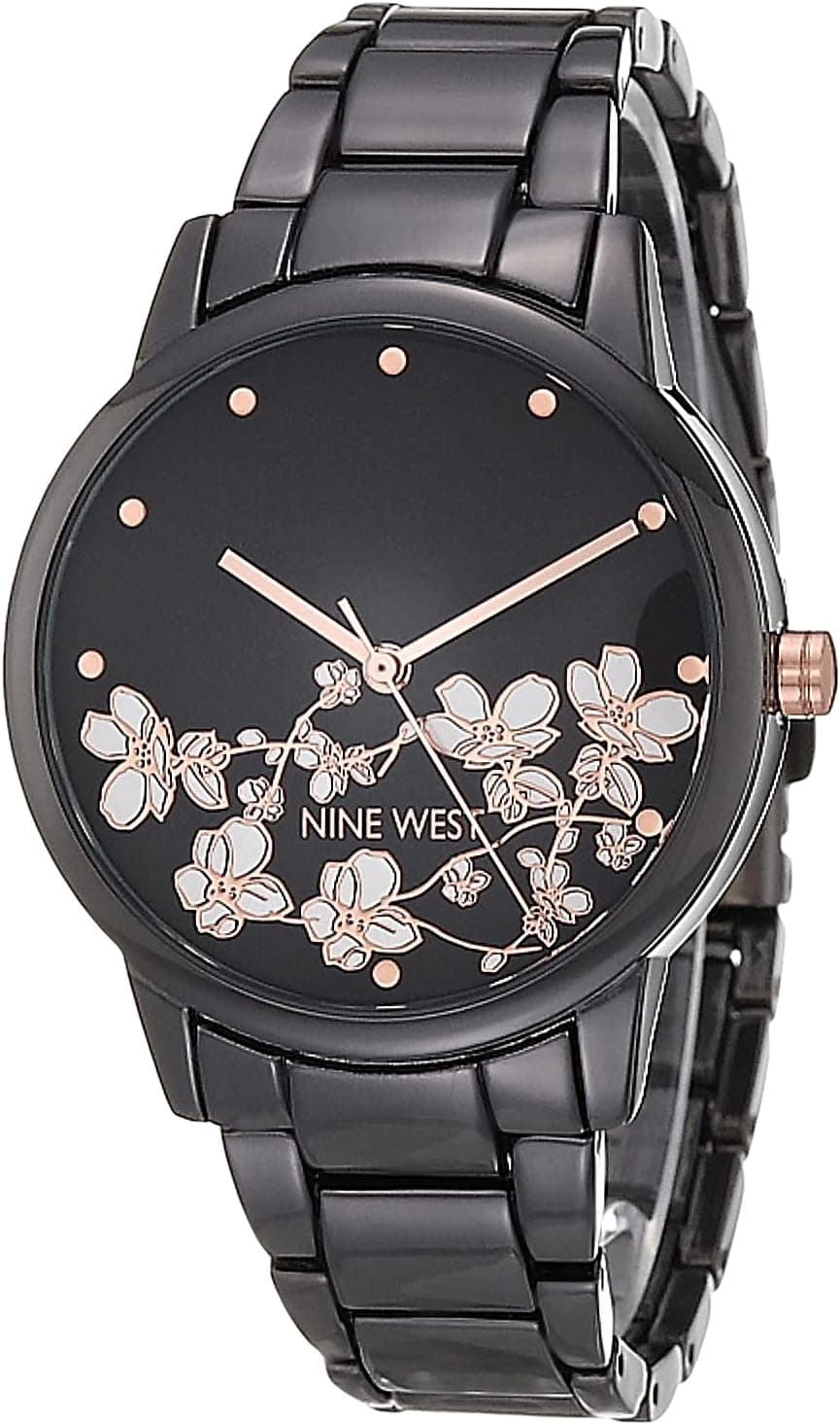
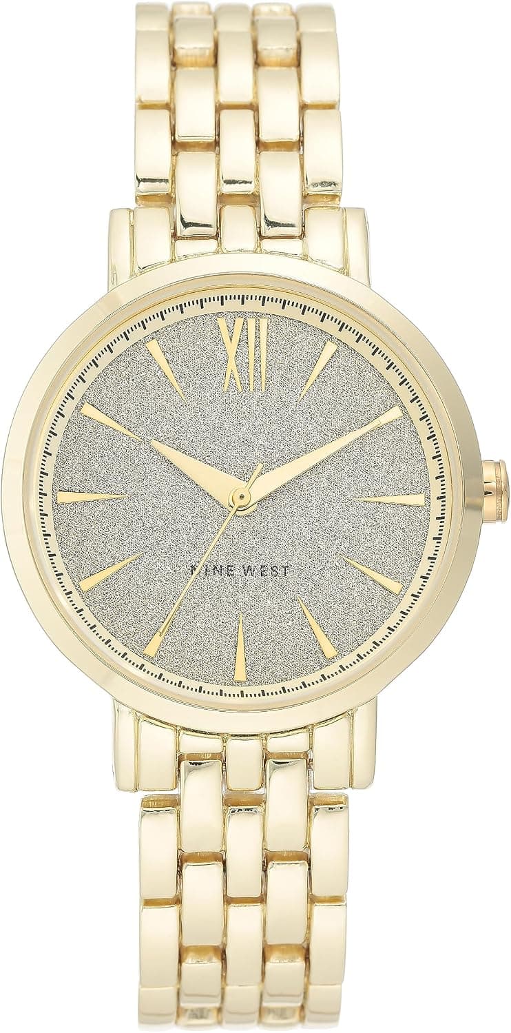
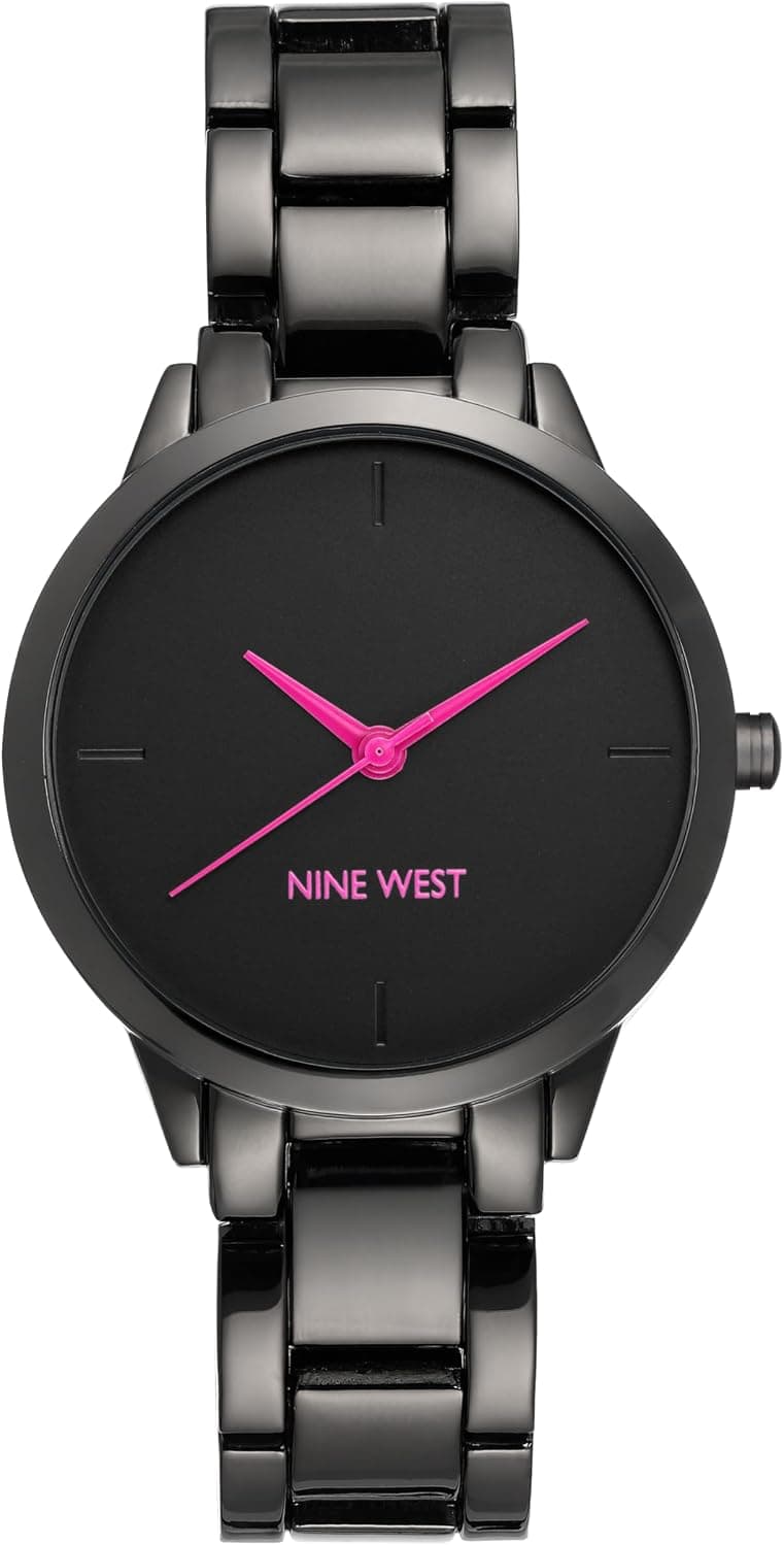
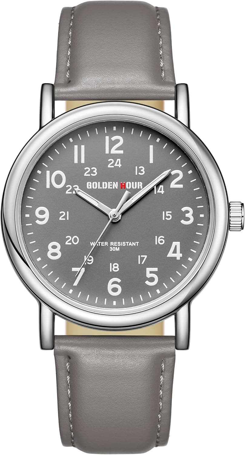
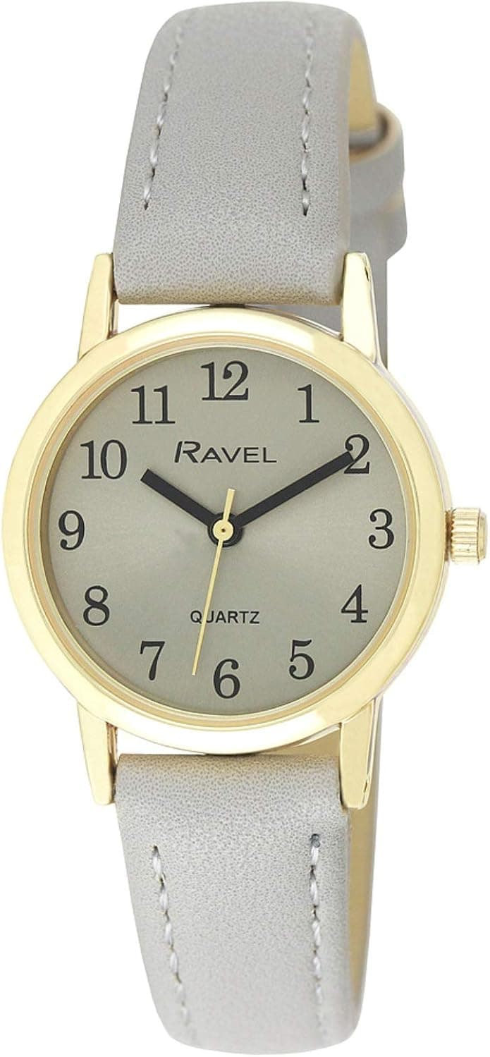
Gray is the quiet sophisticate of dial colors, and like blue it is not a single shade. It runs from cool, silvery slate through gunmetal and anthracite to warm charcoal, and the right gray can read almost dressy or distinctly tool-like depending on its tone and finish. Finish does much of the work here. A sunburst, or sunray, gray uses fine radial brushing that catches light from the center outward, so the dial can look pale silver in one moment and deep charcoal the next as you turn your wrist. A matte gray stays even and understated, ideal on a field or sport watch, while a textured gray, whether embossed, frosted or patterned, adds depth that flat colors cannot. Unlike black, gray softens contrast with the hands and markers, giving a more relaxed, modern look that has grown steadily in popularity.
Real examples exist at every level. At the top, Grand Seiko has made textured gray a signature: the SLGH005 'White Birch' carries a silvery, bark-patterned dial at roughly $9,100, while the Snowflake SBGA211 sits near $6,300 retail, and the 'Mt. Iwate' dials use a rugged texture inspired by the mountain near the Shizukuishi studio. The Rolex Oyster Perpetual in slate offers a clean sunburst gray in the steel sport range, typically $5,500 to $6,700 at retail depending on size and availability. In the middle, the Omega Aqua Terra 150M with a gray dial runs around $6,700, and Tudor offers slate tones across the Black Bay and Ranger lines, often near $3,500 to $4,500. More accessibly, Sinn builds anthracite-dial tool watches such as the 556, around $1,400, where a matte gray reinforces the no-nonsense, legible character.
When choosing, start with the tone. Cool slate and silver-gray feel refined and pair easily with formal wear, while gunmetal and charcoal lean technical and suit a sport or field piece. Decide on finish next: a sunburst gray rewards you in person with shifting depth, a matte gray keeps things calm and legible, and a textured gray, as Grand Seiko does so well, gives a dial real presence without color. Watch the contrast of hands and indices, since lighter grays can hurt legibility if the markers are not bright enough. Gray flatters almost any case metal, turning cooler against white gold or platinum and warmer against rose gold or bronze.
It helps to think in sub-types. Slate and silver-gray are the dress-leaning end, quietly versatile and easy under a cuff. Gunmetal and anthracite belong to tool and field watches, where low contrast and matte surfaces aid legibility. Textured grays are the connoisseur's choice, prized for craftsmanship rather than flash. Whichever you pick, gray's real strength is restraint: it is the color for someone who wants a modern, considered watch that never shouts, yet still rewards a closer look.